03
UX/UI
Unum

Timeline
10 months

Role
UX Designer

Team
UX | Design Lead

The initial objective of this project was to develop a proof of concept redesign for a long-term disability insurance product offered by the American corporation Unum. The website's role was to introduce potential Unum customers with IDI (Individual Disability Insurance), provide them with personalised plans derived from their employer's databases, and facilitate their enrolment in the system.
Although this project began as a proof of concept, it was ultimately expanded into a full-scale implementation. This included the handover and collaboration with a full-stack team until the product was successfully launched.

IDI, or Individual Disability Insurance, is a specialised insurance benefit tailored for high-income earners. It addresses the potential gap in coverage for individuals who might not be able to sustain their combined income in the event of a long-term disability. Essentially, this product serves as additional coverage, enhancing their existing insurance to bring them as close as possible to their current salary.
The first challenge presented to us was that despite being an employer-endorsed product, there was a notable drop-off in engagement right at the initial landing before a user even had the chance to explore any personalised options.
Therefore, our focus shifted to:
1. How might we streamline the enrolment process?
2. More importantly, how can we immediately show the value of this product to an employee, ensuring they at the very least explore their personalised product offer?

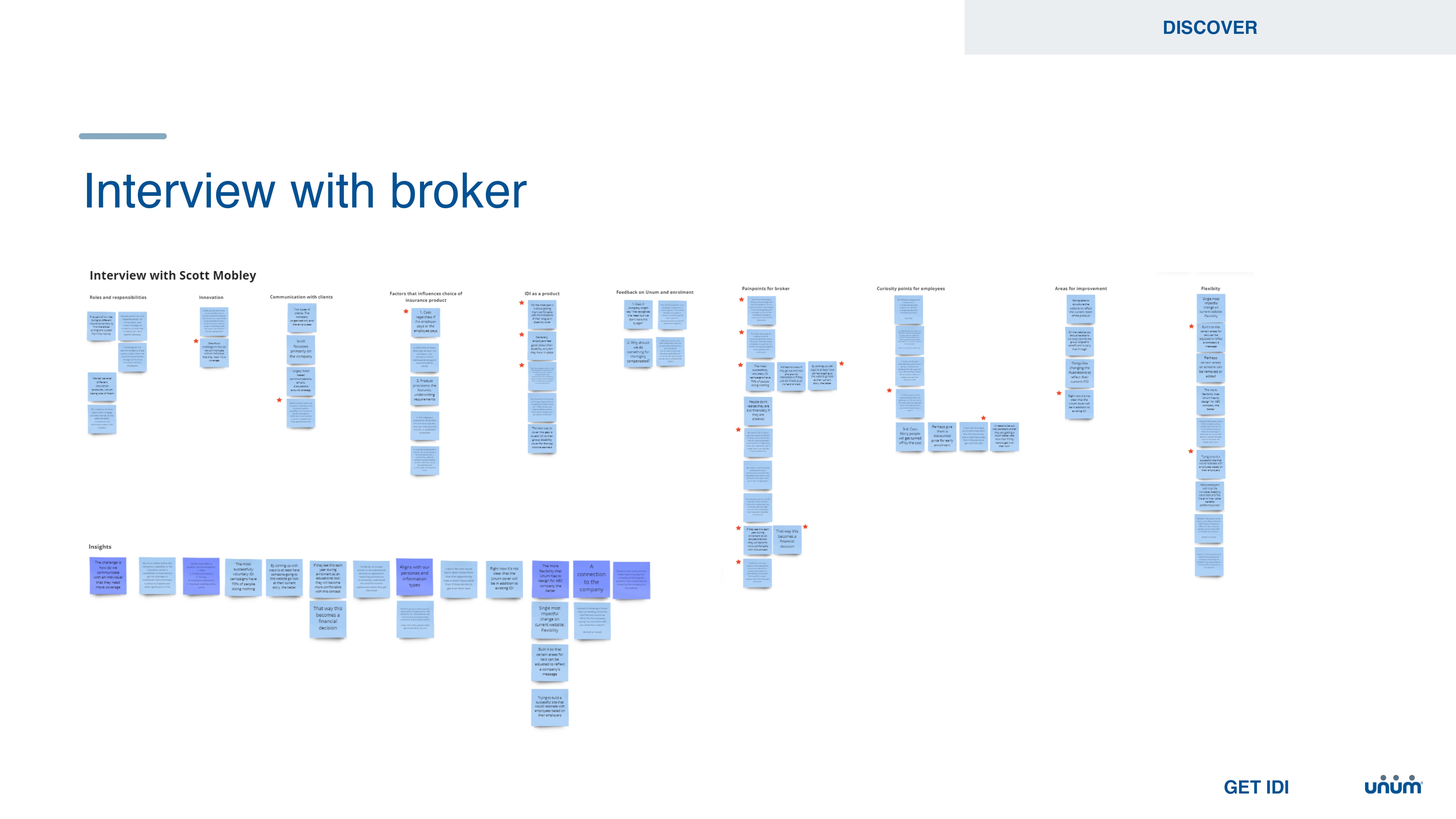
Our first action item was to conduct an extensive investigation to pinpoint the exact drop-off point. This involved conducting interviews with some of our current clients and walking them through the enrolment process. We needed a thorough understanding of the specific factors that were causing potential users to abandon the enrolment at the homepage. This feedback was then distilled into two separate personas that would shape our design decisions.
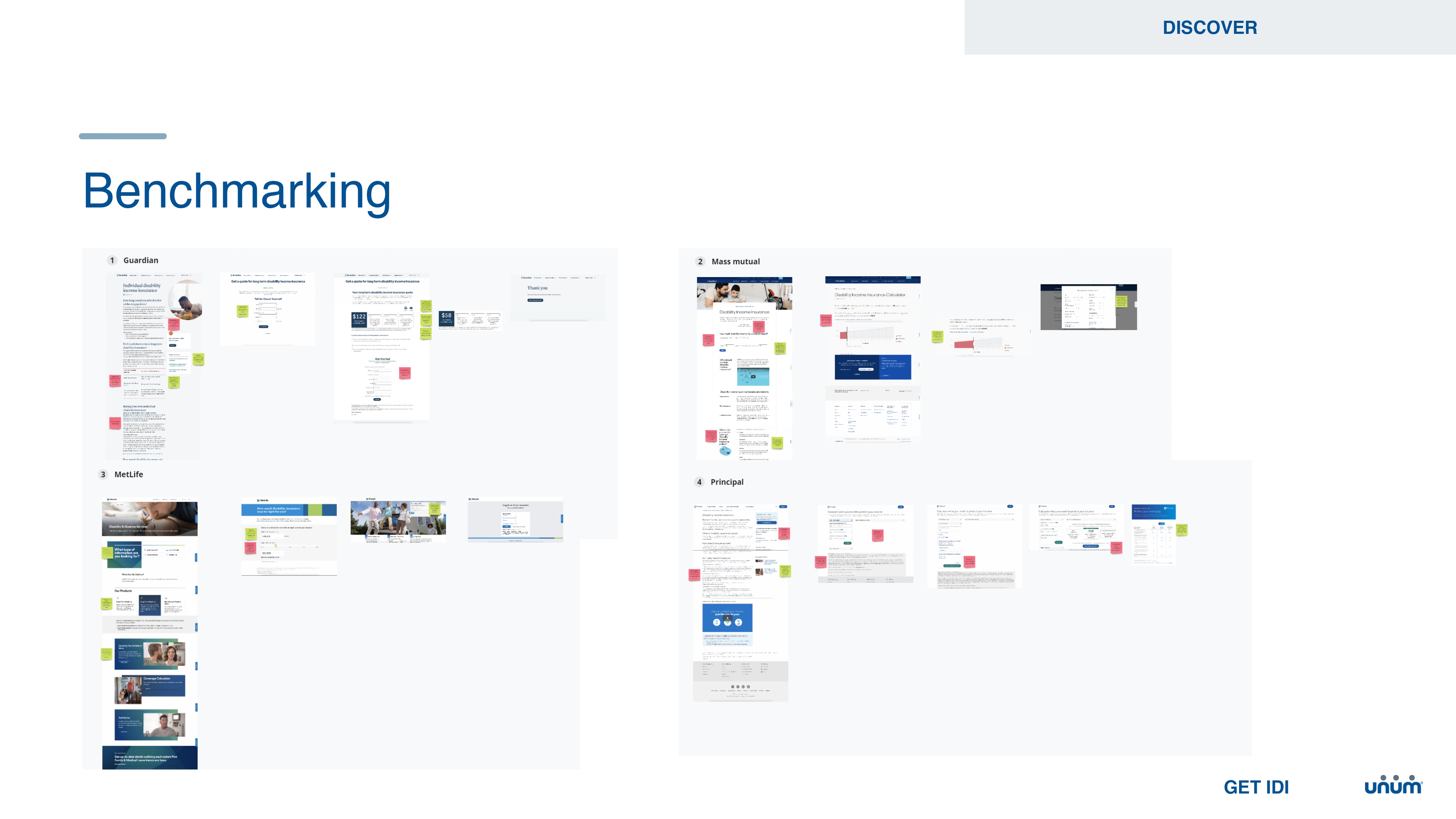
Additionally, we completed a benchmarking exercise to assess which strategies competitors in the same space were using and which approaches we deemed to be effective. Drawing from all of this information, we created wireflows that served as the groundwork for our initial designs.


One of the first changes we made involved reposition the login option to a more prominent position for users to access their plan options. Despite the fact that the business would already have information about the employee, we needed users to provide their last name, date of birth, and the last four digits of their social security number to validate their identity against the database. However, users interpreted this as a signup form for a product they hadn't yet fully understood or committed to. It was understandable therefore that they were hesitant to input this information.
When moved the previous 'Login' screen and clarified that it was simply a means to confirm their identity, rather than a sign-up screen, this concern became much less significant for first-time users.

We also recognised that our current homepage did a poor job of explaining what Individual Disability Insurance (IDI) entails. This lack of information left many users unenthusiastic about the product offering. Before delving into the specific options available for each employee, it was important to establish the context of IDI. We needed to clarify its purpose, value, and distinguish it from basic medical insurance. There was a notable overlap and confusion among users who might not have been exposed to this very specific policy type before.
We understood right from the start that the success of this project hinged on our ability to explain the intricate concept of gap coverage in the simplest possible way. Users have a general understanding of a medical aid, and they're familiar with disability insurance. However, Individual Disability Insurance (IDI) and gap coverage is an altogether different challenge. How do you communicate to a high-income earner, especially one with a commission-based salary, that there exists a substantial disparity between their disability insurance and their current income?
Our approach placed a significant emphasis on the concept of 'coverage'. IDI would cover a substantially larger portion of the overall income for these specific high-income earners. Essentially, this shifted the focus towards financial well-being rather than purely medical or disability coverage. While we couldn't provide full 100% coverage, we could bridge the gap as closely as possible in the event of prolonged disability.
To illustrate this visually, we crafted various graphs and them through user testing. Some of these became quite intricate as we grappled with getting a balance between visual clarity and conveying crucial data. Interestingly, however, we discovered that a straightforward donut graph and clear information architecture, proved to be the most effective visual aid.

Given that this is an enrolment-focused project, we couldn't overlook the obvious improvements required once a user actually chose to purchase this product. Our aim was to streamline the process, minimising any unnecessary inputs or steps to allow users to complete it swiftly and effortlessly. Recognising that we already possessed all the necessary personal data about the employee, we decided to use a review-and-submit approach rather than asking them to fill out forms, which had a significant impact. Additionally, we identified a few crucial legal questions that were important for the business but in actual fact left users uncertain and hesitant. To address this, we incorporated tooltips and helper text where appropriate to alleviate any confusion.


We conducted multiple rounds of interviews and testing for this project. It began with generative interviews, aimed at understanding the current website and user experience. We followed this up with surveys to gather customer sentiments. Later, we moved on to moderated evaluative testing using draft designs. A substantial amount of time was spent on iterating and testing various login flows. We also refined the terminology and positioning of personalised plan offerings to prevent any pre-conditioned biases for a first-time user.
To resolve a significant internal debate among our business stakeholders, we extensively tested different visual data models to determine the most effective way of presenting percentages, gap amounts, and dollar values in a graph format. We conducted AB testing on a range of visual models and ultimately settled on a version that we believed clearly conveys the product offering and its impact to users. This process provided us with very tangible insights into core issues and served as a valuable reference for stakeholder discussions.
Lastly, we conducted unmoderated and remote testing for both desktop and mobile, using a third-party platform. This final round of testing proved to be highly insightful, as it closely replicated the most realistic scenario our users would encounter, starting from the moment they received an email prompting them to sign up, all the way through to completing the enrolment process.
For this, we set up the testing with a functional prototype and provided a guide that asked questions along the way. Participants were required to record themselves and their screens, speaking out loud as they navigated through the flow. It seemed that when users were left to guide themselves without a moderator, we obtained very candid and direct feedback. This was an intriguing observation, as it suggested that participants felt more comfortable providing honest feedback without the fear of trying to appease a moderator.
Of course, extensive testing is invaluable, but it's equally crucial to ensure we test with the right users. Given the highly specific nature of our personas, we had to exercise caution and only recruit participants who met a specific set of criteria. Leveraging the 3rd party platform as a tool, we implemented screening surveys to identify participants that aligned with our location, salary requirements, and most importantly, already had existing disability insurance. This ensured that our testing pool accurately represented our target audience.

1. This project served as a great learning experience, particularly in dealing with stakeholders. It stressed the importance of establishing strong collaboration with the business team early on, especially during the Proof of Concept phase. Later, when it came to execution and launch, I had to adapt my approach in engaging stakeholders responsible for the project's implementation. My role underwent a significant shift over the course of the project. Initially, my focus was primarily on UX research. However, after receiving additional funding, I had to pivot towards a more comprehensive role as a product designer. This required close collaboration with the development team and an active role in guiding the business team. I found myself advising them on the workings of an agile, full-stack delivery team, as it was their first experience operating with roles such as a product owner and scrum master. While this project presented its share of technical challenges, the most significant lessons revolved around the soft skills a product designer needs to navigate a design journey from inception to completion. It underscored the importance of holistic skill sets in this role.
2. Due to the changing scope of this project, we unfortunately did not have a dedicated analyst on this project. Initially, I anticipated this might be a minor inconvenience given the project's size. However, as the development phase progressed, it became evident that this gap presented a substantial challenge. As the developers delved into a specific functionality, it unearthed complexities on the front-end due particularly because of the fact that we were repurposing an existing database. This experience underscored the importance of conducting a thorough technical analysis prior to a design handover. It serves as a vital step in preventing the back-and-forth process during production, ensuring a smoother development journey.
3. We were really fortunate to have an extensive testing budget for this project which was really refreshing. It marked the first instance where I had the opportunity to use a variety of testing methods, from generative interviews and surveys to moderated and unmoderated remote testing and even AB testing. It was enlightening to observe the unique value each testing method brought, particularly in relation to the specific project phase and the type of data collected through these different approaches.