02
UX/UI
Rewards

Timeline
4 months

Role
UX/UI Designer

Team
UX | Design Lead

While collaborating on a project with a major financial institution, I was tasked with reevaluating the rewards system for one of their insurance products. The central business model centered around giving cash back to policyholders based on their ability to maintain safe driving practices. Each user was equipped with a telematics device in their car, which calculated key metrics such as driving time, night driving, and driving behaviour.
This intervention offered a dual benefit. For customers, it meant substantial returns on their monthly payments directly back into their own pockets. More importantly though, for the insurer, it represented a potential reduction in claims. The idea was that when customers are actively striving to drive more cautiously, they would automatically lower their personal risk as drivers on the road.
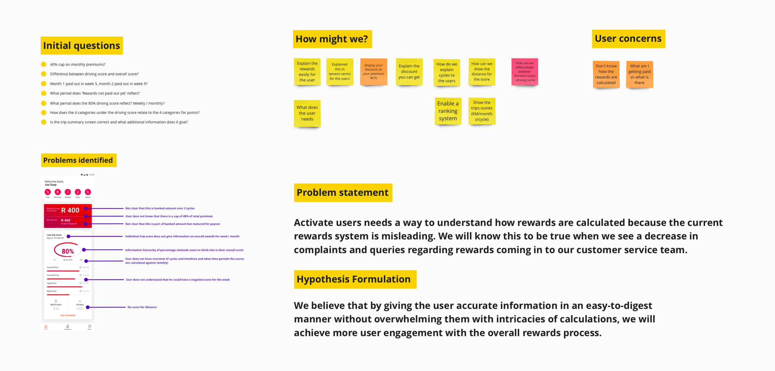
The initial problem identified by the business was that users required two additional data points to comprehend their final monthly cash back amount. Essentially, the business felt that the current dashboard was challenging for users to interpret, leading to an increase in customer complaints and a decline in user engagement. However, after doing a comprehensive analysis of this feature, it became clear that the usability of the product required a much deeper overhaul.
As we started to unpack the problem, it became apparent that there was a disconnect between the information captured by the telematics device and what was displayed on the user dashboard. Users were asked to modify their driving behaviour but had no visibility into how these adjustments contributed to their monthly rewards. As a result, they had little incentive to make positive changes to their driving habits.a
With the actual user problem identified, the next step was to secure stakeholder approval in order to adjust the project's scope. Armed with the raw analytics and data, we wanted to demonstrate to the business the potential of this new solution and the long-term value it would bring to their product. Fortunately, we successfully obtained the necessary buy-in and then began a complex journey to reimagine the model for this existing product.
We worked closely with the original data scientist who originally conceptualised the product model and carefully dissecting the complexities of this product. Our goal was to transform this existing system into something that could be more intuitively understood by our users. After numerous iterations, we ultimately adopted a new mental model that we believed would be visually comprehensible for our users. However, what was even more critical was the need for a system that would enhance user engagement and leverage this functionality, positioning the product as a fierce competitor in a dominating insurance space.

Right from the start, we realised that our most significant achievement would be to simplify this complex data model and present it in a user-friendly manner. There were three key metrics used to calculate a weekly total score: total driving time, night driving, and a general driving score. We found this setup to be somewhat misleading, as users were provided with a lot of detailed information about their driving score, even though it carried the least weight in the overall calculation. On the flip side, a similar metric, driving time, had a much more substantial impact on the user’s score, yet there was no visibility into the total driving hours; users could only see a specific time period.
This same situation applied to the last metric, night driving. Users lacked insight into a specific value amount, leaving them without a benchmark to adjust their driving habits. Additionally, users were never informed of the time frame that constituted night driving (22:00-04:00), which again left them in the dark about how to modify their behaviours.
After identifying these critical oversights, our solution was straightforward: prioritise important information and ensure that users have a comprehensive understanding of the parameters for these metrics. We believed that this approach would not only reduce confusion and complaints but also create a sense of transparency and trust with our customers.

The only exact way to present users with accurate data regarding their calculation unfortunately meant displaying a negative score when they lost points. This sparked a significant debate within our team because, on one hand, it would offer a true and precise representation of the data. However, we were genuinely concerned that users might become discouraged by seeing negative points. We explored various visualisations, including bar graphs, line graphs, percentage points, and rand values. Ultimately, we opted for the simplest model: pie charts presented in a point format, the total of which would provide users with a percentage of their cash back. Of course, this is a rather intricate piece of information to communicate therefore we incorporated a small guide at the top of the homepage to assist users in understanding it.
It was crucial for us to emphasise that even if a user earns full points for the month, they would only be eligible for a maximum of 40% cash back on their premium. Many customers were under the assumption that achieving full points would equate to receiving the entire premium amount back, which, from a business perspective, was simply not feasible.
We also identified that users were experiencing frustration due to a lack of understanding about how points would accumulate and be paid out in specific cycles. To address this pain point we incorporated a weekly breakdown of points. This feature illustrated how behaviour on a weekly basis contributed to the overall monthly points in total.

Of course, all of our assumptions would be baseless if we couldn't validate them with actual user feedback. Therefore, our next step was to validate these initial designs with real users. We conducted remote, moderated testing involving 12 participants over a span of two days. This process gave us invaluable insights regarding our designs. Some of the feedback was surprising, while others confirmed our initial expectations.
We were particularly concerned about the level of detail we needed to provide in order for users to grasp the points system. Did users prefer open, transparent data even if it displayed negative values, or would this level of transparency be discouraging for them? The answer, adding another layer of complexity, turned out to be a bit of both. Users expressed appreciation for the transparency, but it also acted as a significant deterrent to their engagement with the system.
Equipped with a wealth of feedback, the final step was to analyse these insights and translate them into new designs. As is often the case in UX, this required a delicate balancing act to ensure that we integrated our testing outcomes effectively. To implement our negative scoring model, we created a new design that used the principles of progressive disclosure. We opted to maintain transparency regarding negative values, however if a user wished to see the full details of their score, they could navigate away from the homepage to access this information. This approach allowed us to display the actual values without discouraging users based on their current scores.
Finally, we held a session with the key business executives and carefully presented all the feedback and insights we gathered from our testing. We adapted our presentation to highlight the research outcomes with the original business objectives. Despite the highly technical nature of the work, we managed to convey the value of this design discovery process. This not only secured buy-in from our stakeholders but also led to a request for an expansion of this project. For us as a design team this was a significant victory, especially considering our initial mandate.

This was without a doubt this was the most technically complex project I've tackled thus far. Yet, it proved to be an invaluable learning experience, leaving me with several noteworthy insights:
1. We're frequently advised not only to ensure we design things correctly but also to ensure we're designing the right things. This project illustrated that principle really well. What initially seemed like a straightforward request to restructure a dashboard evolved into a profoundly meaningful research piece that included a lot of opportunities for the business.
2. The essential condition for broadening the scope of an initial brief, of course, is that stakeholder buy-in is non-negotiable. If you can effectively communicate in clear and relatable terms the significance of robust UX research to business, and you have their backing, it will significantly influence the success of the entire project.
3. This was my first time working on a project that is very data heavy and statistical. I was fortunate to partner with a dedicated data scientist, and their role was crucial in untangling and grasping these complex data models. It was a good reminder to value and utilise specialists in our agile teams. Expecting a designer to be an expert in every industry and application type is just not practical. The real skill lies in extracting useful insights from these experts and weaving them into the user experience.