05
UX/UI
Move

Timeline
2 months

Role
UI/UX Design

Team
UX | UI mentor

Responsibilities
Design development | UI design | Brand design
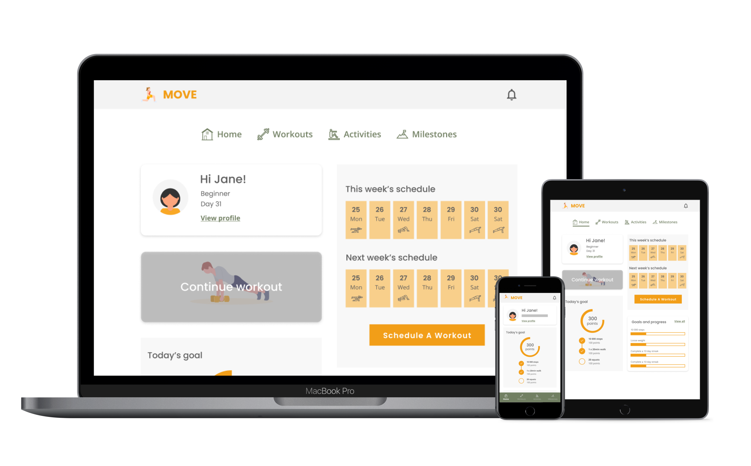
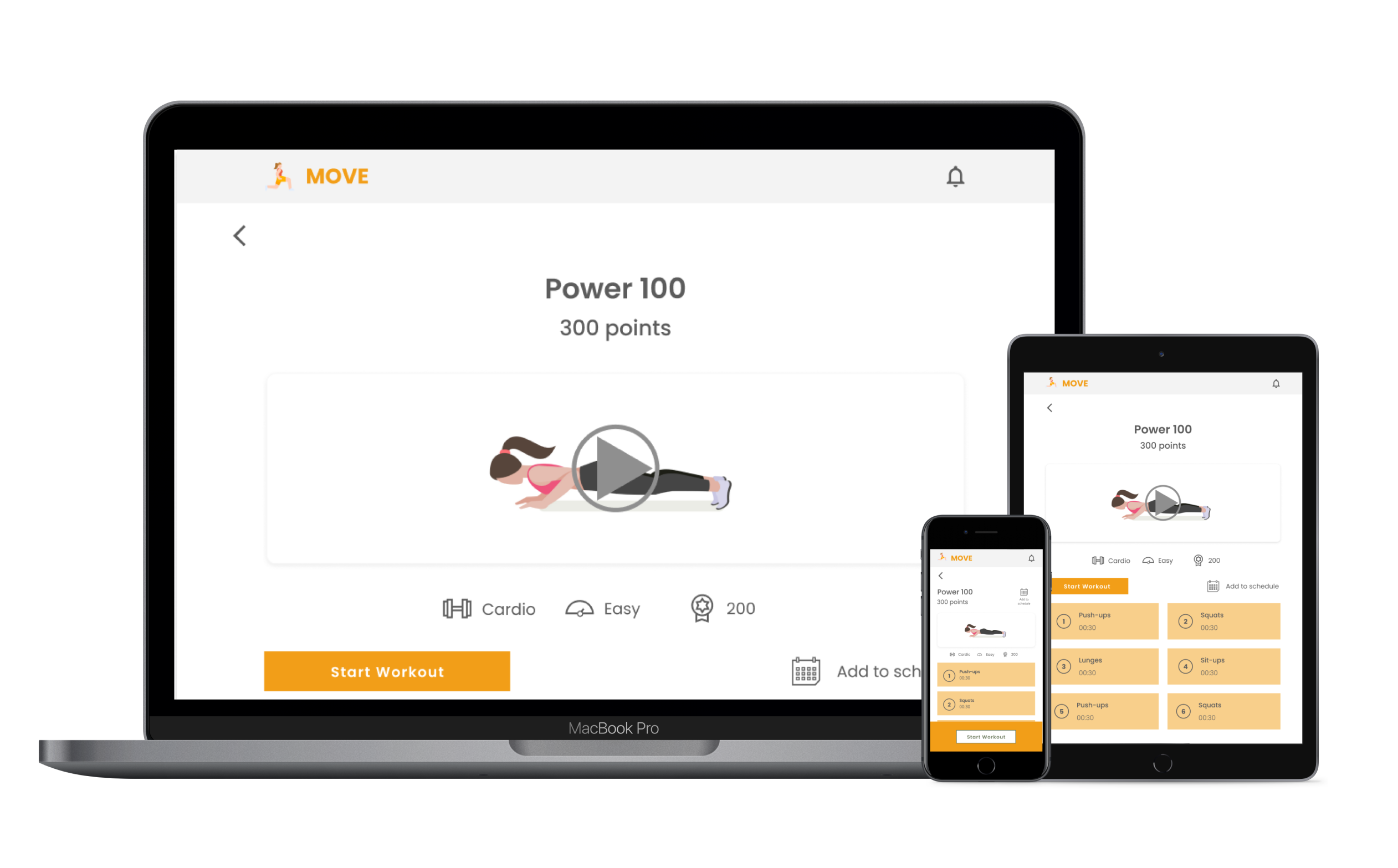
During a 2-month specialisation course in UI design, I was tasked with creating designs for a fictional fitness app named 'Move'. Initially centered around UX design methodologies, the project eventually shifted its focus towards visual design. During this time we explored visual design principles and current trends, learning how to effectively utilise colour, typography, iconography, imagery, and interactions.
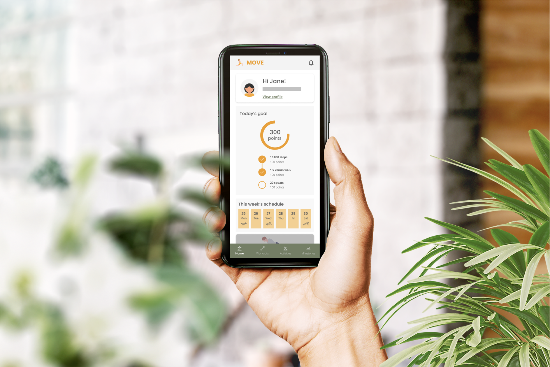
The objective for this project was simple: to inspire individuals to discover an exercise routine that matches their fitness level, schedule, and interests. Locating suitable exercise routines for one's current level of fitness can be challenging and somewhat daunting, which is why many individuals face difficulties in getting started. This responsive web app aims to simplify the process of starting a workout as much as possible. This might involve a straightforward 5-minute routine that automatically adjusts based on your fitness level, available equipment, and preferred focus area. A secondary emphasis was placed on user engagement and motivation. How do we establish a workout routine that is sustainable and encourages users to return consistently? What would motivate a user, and how can we provide them with visual encouragement and motivation?
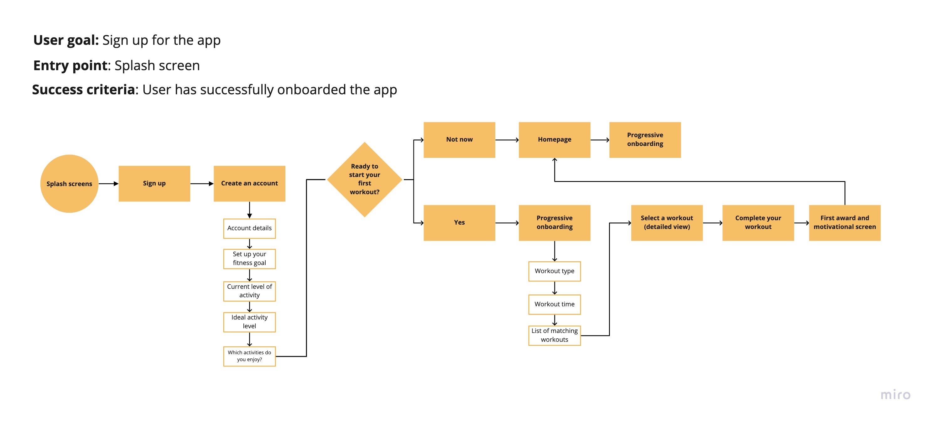
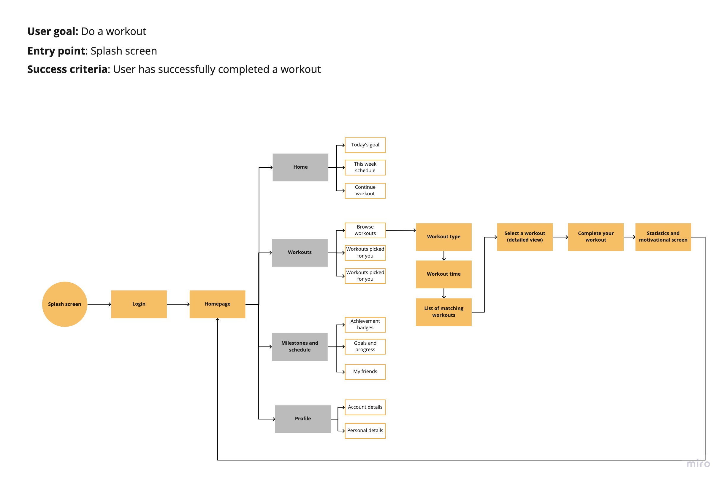
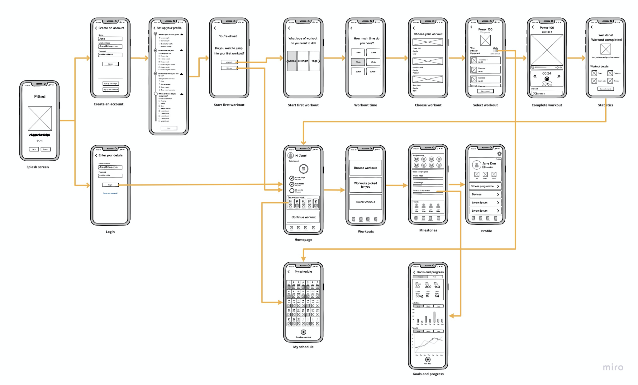
Given that this project predominantly centered around UI design, the UX research was provided in the original brief, including a persona, feature requirements, user stories, and partial branding guidelines. The initial phase involved creating user flows derived from the brief's specifications after which these were translated into low-fidelity wireframes.
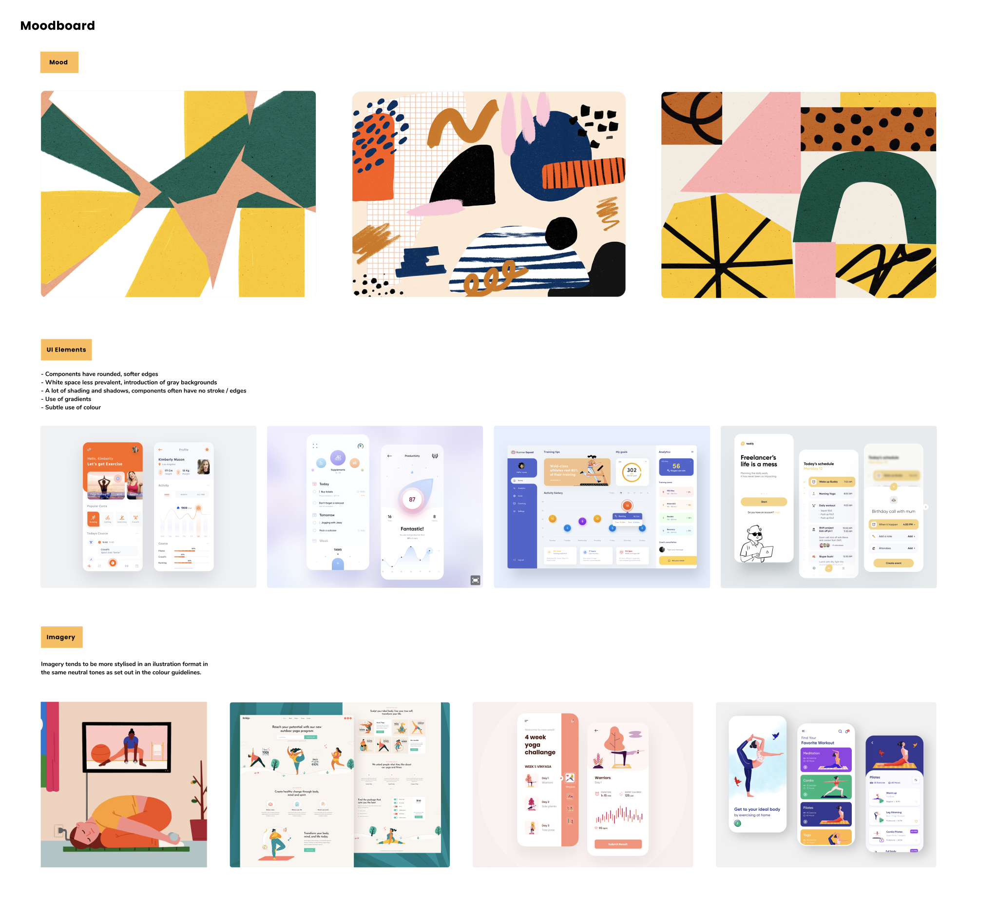
Significant effort was also dedicated to defining the brand guidelines and curating a moodboard that aligned with the brief's objectives and the app's intended purpose.
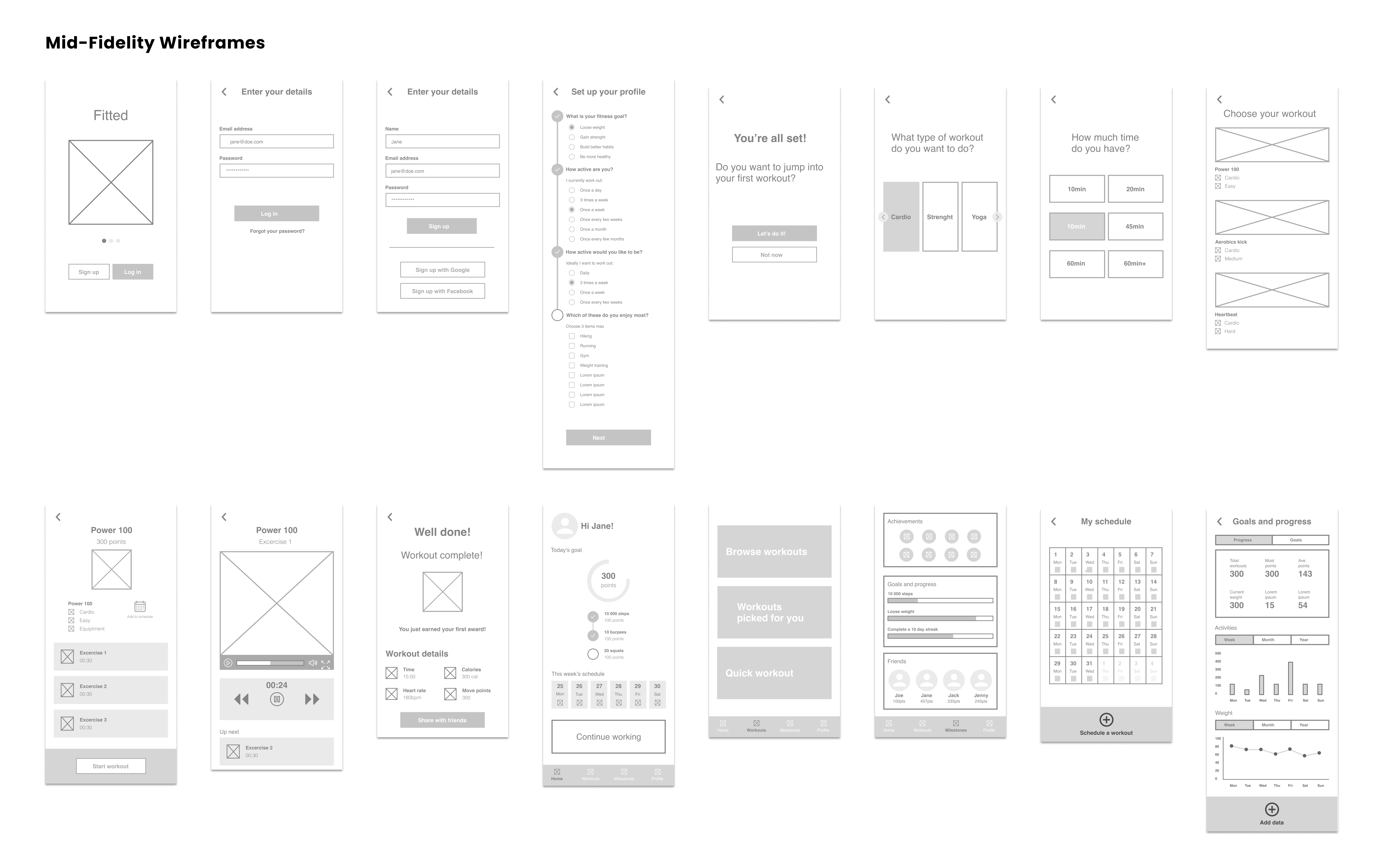
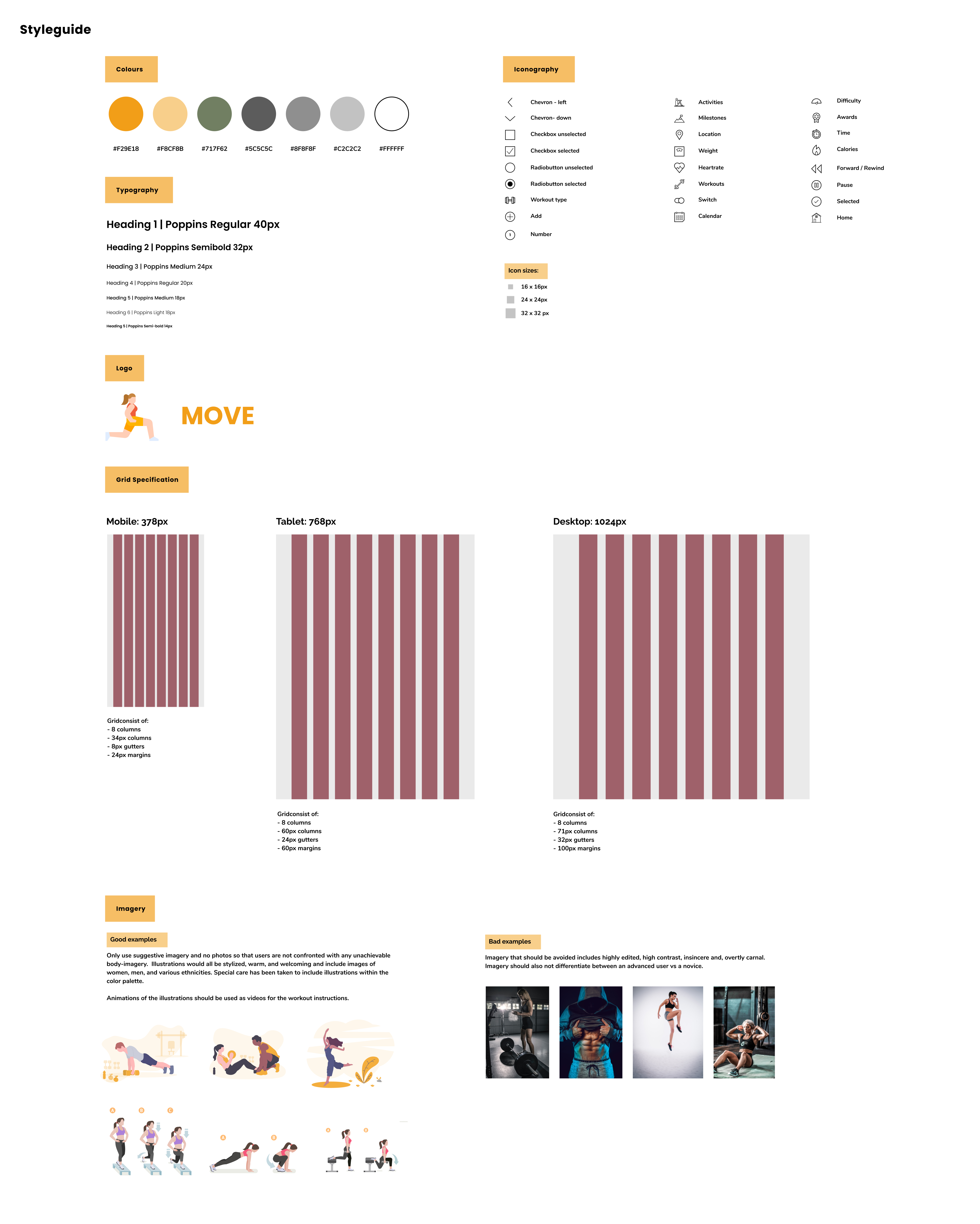
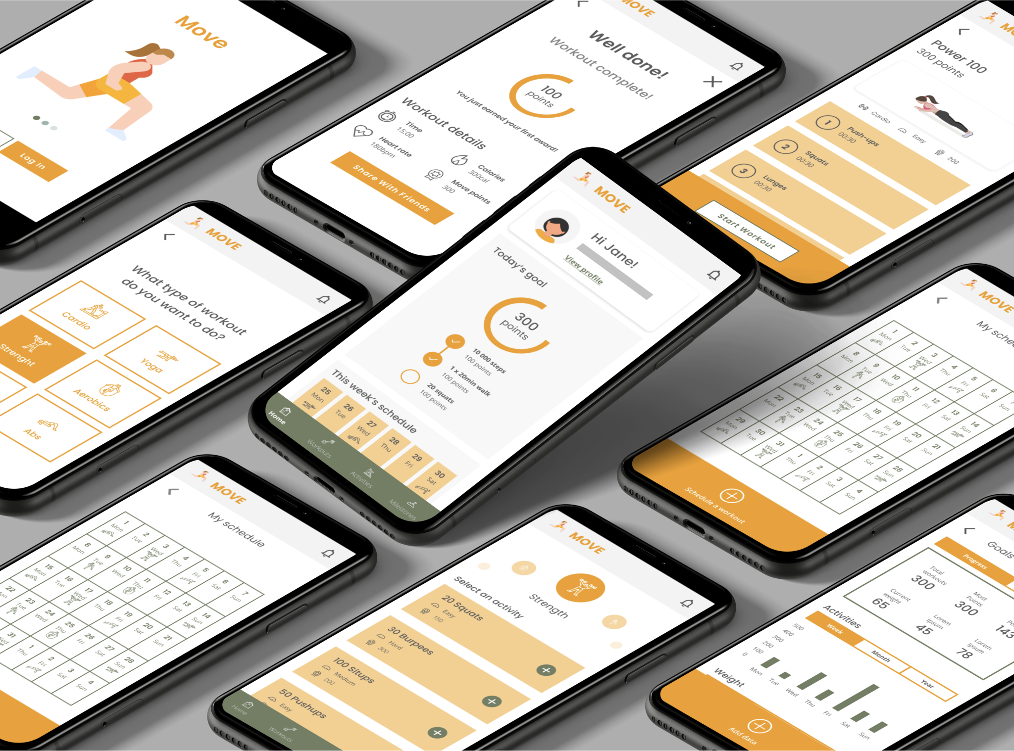
Once a basic framework was established, the designs were refinement to ensure consistent spacing, typography, colour, and imagery. Additionally, custom icons were created, and animations and gestures were integrated. All of these elements were incorporated into a clickable prototype. The final phase of the process focussed on the handoff between designer and developer, which included a style guide, designs for various breakpoints, and the exportation of assets.
Throughout the coursework, significant emphasis was placed on consistency in UI design. Achieving visual balance and harmony fundamentally hinges on maintaining uniform spacing, sizing, weight, and colour across all elements. Any inconsistencies, regardless of its size or importance, will be immediately noticeable to a user and could potentially jeopardise the overall balance of a page.
Although initial testing took place after the creation of low-fidelity wireframes, a second round of testing was initiated after the prototype was updated with all the correct UI elements and components.
As part of the course, one-on-one sessions were conducted with a specialised UI mentor who provided feedback on each task. Design adjustments were made at each step based on her input.
It was interesting to consider aspects of the UI, such as brand guidelines, which are typically provided by the client. I realised that working with a well-defined visual language significantly facilitates the design process. It can be somewhat overwhelming to be tasked with selecting everything from fonts to imagery, and on top of that, creating custom iconography. This project definitely gave me a newfound appreciation for the valuable contributions that dedicated brand and UI designers bring to any project. Although the differences may seem minor, the use of high-quality has a substantial impact on the overall impression and quality of a design, a factor that should never be underestimated.