01
UX/UI
Gen+

Timeline
10 Weeks

Role
UX Designer

Team
UX | UI | Design Lead

Gen+ is a leadership development program tailored for young Scottish students in years S1, S2, and S3. Operated primarily by teachers, this non-profit organisation aims to equip young individuals with essential leadership and self-development skills. Our engagement began when the client approached us with an existing classroom-based course. Their goal, however, was to transform it into a digital format suitable for iPad use by students. This project was such an unexpectedly delightful success that it was eventually shortlisted for the Technology Ireland Awards.
We immediately knew that our biggest challenge given the type of project and our users would be engagement. The challenge was clear: How do you create a platform that captivates and motivates young children to learn about leadership? It's no secret that children today are bombarded with a constant stream of stimuli, all vying for their attention and interest. This reality initially posed an intimidating prospect, especially for me as the UX designer. The uncertainty of designing for children as users was a significant concern. I found myself grappling with questions about what children would find engaging, what they truly needed, and what they would find appealing. Furthermore, due to budget constraints, time was of the essence. We couldn't afford the luxury of extensive UX research that might be available in larger corporate projects. We needed to deliver good work to the clients within a tight timeframe.
So, our objective was straightforward: How might we create a fun and exciting learning environment for an 11-year-old child within the confines of a conventional classroom setting? This question guided our approach and decisions throughout the project.


Our initial priority was to define the metrics of success with the clients. Given our tight timeline, it was crucial to ensure mutual understanding and readiness to tackle any potential challenges together.
Following this, we conducted desk research on learning management systems that offer similar functionalities. We were looking to understand what works well and where there might be opportunities in our own product. And lastly, knowing that gamification would be an important element in our designs we had a look at some of the more effective methods and usages in other applications. This research served as a solid foundation for our brainstorming sessions.
The client provided us with a list of user stories which we then converted into a list of core functionalities. This formed the basis for our interaction flow, eventually evolving into a site map. Additionally, we drafted a comprehensive end-to-end journey map from both the student and teacher perspectives. To validate some of our assumptions, we held a focus group session with the teachers.
With this groundwork in place, we quickly moved on to wireframing. Leveraging their brand guidelines, we created a robust design library with components, enabling us to efficiently develop high-fidelity clickable prototypes.


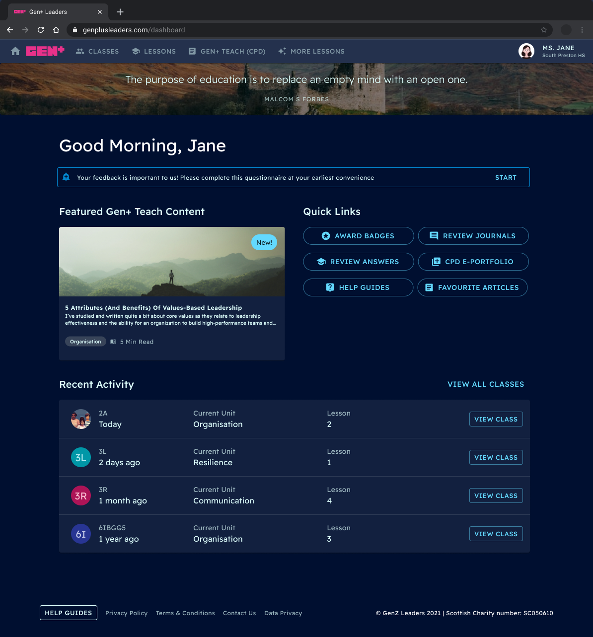
To encourage immediate engagement right from the onboarding process, we introduced a unique feature where students could select a personalised character. This character would serve as their avatar, prominently displayed on their dashboard, and would evolve and grow as they progressed through the course. This character would be their avatar visible on their dashboard and would evolve and develop over time as they complete the course. We drew inspiration from the character development seen in video games, a familiar and relatable concept for our target audience. Our aim was for students to establish a strong connection with their chosen character, fostering a sense of personalisation that would, in turn, instil a feeling of ownership and commitment to the entire course.

A significant aspect of our gamification strategy revolved around on implementing a badge system designed to recognise and reward students for various achievements. Some badges were earned upon completing a lesson, while others, identified as boosters, were awarded by teachers to reward excellence in specific areas: Effort, confidence, creativity, and behaviour. Additionally, students had access to a comprehensive list of all available badges, encouraging them to aspire for a complete collection.

The student-related features and functions were consolidated within the student platform, accessible through a web-based portal on their iPads. The dashboard offered an overview of the key sections of the interface, provided feedback on their progress, and displayed their personal avatar, which would adapt and evolve each time they returned after a class. And of course, the most important feature was the lessons themselves. These were accessible from the lessons page and also through a shortcut on the dashboard. This ensured that students could quickly pick up right where they left off and dive straight into a lesson in a new class.


The interface designed for teachers was specifically aimed to provide content relevant to their roles. They had access to the exact same course content and lessons, along with additional features allowing them to view their class, manage individual students, award badges, and view articles and resources.

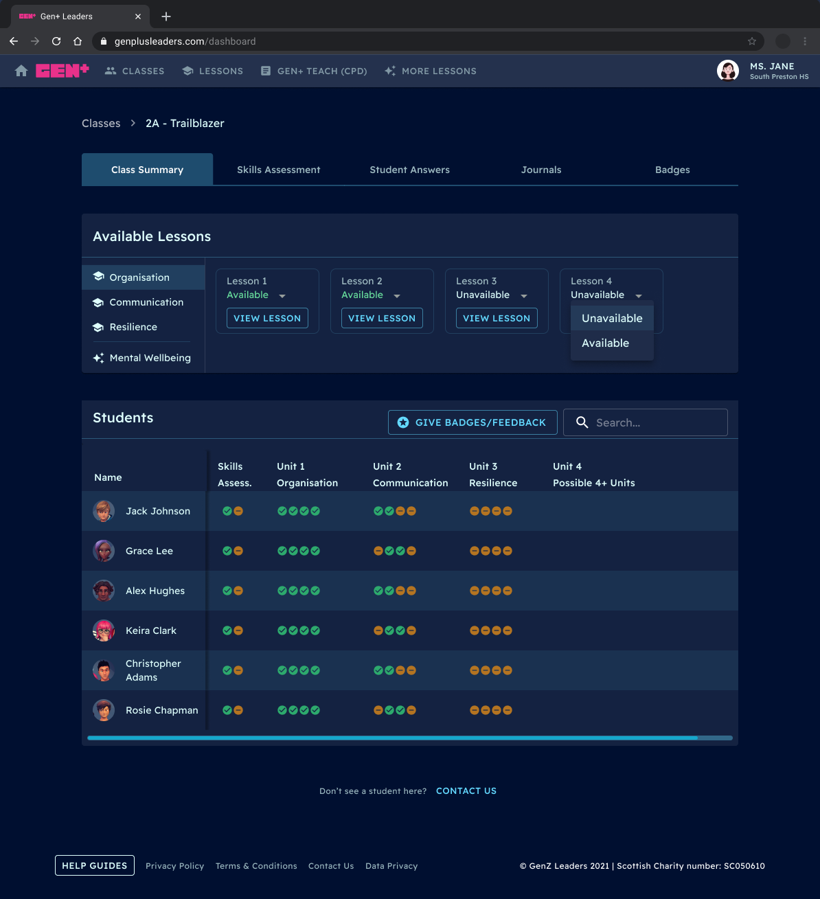
Although there were no formal tests or evaluations, students were requested to complete a skills assessment at the end of each year. This assessment remained accessible until they completed all three years. The purpose of this self-assessment was to demonstrate to the students, based on their own inputs, the progress and learning they achieved over the year. It also aimed to showcase their proficiency in specific skills, like collaboration. Teachers had access to the same information, using it as an indicator for any potential challenges students might face. The hope was that a teacher could adapt the in-person class to suit a specific student should the need arise.

A significant pain point highlighted in the focus groups with the teachers was the need for a unified environment to complete Continuing Professional Development (CPD) tasks, along with easy access to resources. Although this wasn't initially outlined in the brief, we later integrated this feature, which eventually became a crucial part of the teacher's platform. Teachers could access an extensive library of CPD articles, videos, and podcasts. They also had the ability to save these resources as part of a portfolio of their work.

Given that we essentially had two distinct versions of the platform, we also needed to conduct testing with both user personas: the children and the teachers. We understood that not only would they require very different practical features and functionalities, but they would also interact with the platform in very different ways. Following our initial focus group where we gathered our generative insights, we then conducted two rounds of evaluative testing sessions with both students and teachers once we had high-fidelity wireframes.
As the UX designer on this project, I took full responsibility for these sessions. Initially, I was somewhat uncertain about testing with children. There were many specific considerations and legal compliances that were entirely new to me. We had to ensure that each child was accompanied by a guardian, that our testing guides were pre-approved by the teachers, and that no recordings were made available to protect the privacy of the children. More crucially however, we needed to communicate in a way that resonated with a child, especially at this somewhat awkward pre-teen age, in order to gather valuable research. Fortunately, we received guidance from internal colleagues who advised us on the best approach to take.
To our surprise, the sessions went extremely well. Once we established a basic rapport and ensured that the children felt heard and respected for their thoughts and beliefs, we received a many useful insights. It was also quite refreshing to observe that the children displayed a candour and natural openness that we seldom encounter in adult participants.
When it came to feedback sessions, we prioritised ‘fast feedback,' a method that involves analysing and summarising insights concurrently with the data collection. Due to budget constraints, we couldn't afford to spend days transcribing notes and compiling recommendations afterwards. Therefore, we had to manage these tasks between sessions. Despite the time pressure, we managed to conduct a strong feedback session with a list of practical recommendations within a day or two after concluding the interviews.


1. Despite my initial apprehension about working with children, I quickly realised that users are essentially just users, regardless of their age. Once I engaged with the kids with the same level of respect and care as we would with any adult participant in a study, they naturally opened up and freely offered feedback and suggestions. The key takeaway here mirrors that of any UX study: all human beings have an innate desire to be heard and listened to, irrespective of their age. If you ensure that your participants genuinely feel this in the first few minutes of a discussion, you'll have a much easier time working with anyone.
2. This was definitely the shortest project I’ve ever been a part of. I've grown accustomed to longer projects with sufficient time for research during discovery and definition phases. It was impressive to see how much we accomplished in such a short span, thanks to our small but efficient design team. By dividing the workload based on our individual strengths, we maximised productivity. While I focused on UX analysis, the UI designer worked on a comprehensive component library. This allowed us to quickly generate wireframes as one example. This experience highlighted the importance of leveraging each team member's strengths in a design project.